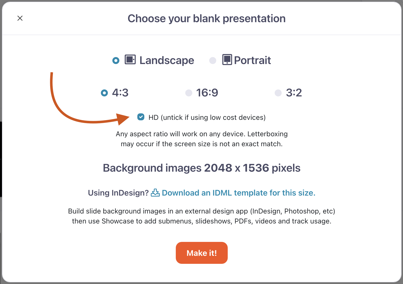
Showcase slides are available in the three most popular aspect ratios: 4:3, 16:9, and 3:2.
This means your designs will look great across a number of devices without needing to be amended for each one.
When you create slides and background images for a new presentation, you want to pick the aspect ratio that you think will be in the hands of most of your users. These users will have a pixel-perfect fit with your slide designs taking up their entire screen.
If a user views your presentation on a device with a different aspect ratio, they’ll still have a pixel-perfect experience (as in, it won’t stretch or distort) but they’ll have some black space around the edges. This is called 'letterboxing' if you're up with the lingo.
If you've got a lot of iPad users, start with our 4:3 template and design your slides at 2048 x 1536 pixels.
If your users are mostly going to use Showcase on popular Android devices, iPhones, or on Windows devices with wide screens, use our 16:9 template and design your slides at 2048 x 1152 pixels.
If your users are a fan of late-model Windows devices like the Surface Pro 3, use our 3:2 template and design your slides at 2048 x 1365 pixels.
If you want your slide to scroll vertically in the app, you can make it taller than the specified pixel height, but the same width. So for example, an image that's 2048 x 3000 pixels added as the slide background to a 4:3 template will show the top 'half' first, then the user will be able to scroll to see roughly half as much image again.
For more detailed information on slide background sizes and dimensions, read our article about importing PowerPoint slides.
PPI
If you're used to designing for print, you might be wondering what resolution — or DPI — you should be using in your designs. The nice news is that when designing for Showcase slides, the resolution doesn't matter nearly as much as the pixel dimensions above. Make sure you're using the minimum resolution of 72ppi for any PNGs you export, and you should be golden.
If your images are coming up with a large file size and you want to save some space, we recommend compressing them with ImageOptim.
If size is still a concern, you could always make a non-HD version of your presentation. You can find the HD checkbox when you create a new presentation.


